Fantinel.dev v5 is here!
10 min read
Out with the green waves, in with the rainbow of pastel colors!
I was recently working on some form styling for a project and the design had this example of a group of checkboxes that spread out in 3 columns:
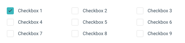
That's pretty simple to do, right? Just add display: grid to the parent and set grid-template-columns: 1fr 1fr 1fr.
However, things don't look so good when there's only 3 checkboxes:
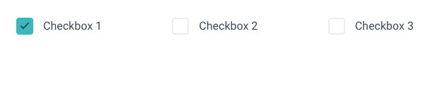
When there's only a few choices, they look better and are easier to read if displayed vertically. So, if there are only 3 items, ideally grid-template-columns would only define one column. But how can we hot-swap between these rules without doing some hacky server-side/JS tweak?
The :has() CSS selector has been available on all major browsers since December 2023 (Firefox was the last to implement it), and is often called the "Parent selector". With it, you're able to select an element based on what it contains. For example, you can select every p element with some bold text (strong) inside by doing p:has(strong). That's already quite useful, but the neat thing is that you can use more complex selectors inside it as well.
We have the :nth-child selector that usually allows us to select every nth element and then do something with it. So, let's say that in our checkbox example above, we want to make the color of the fifth checkbox red. We could do something like:
.group .checkbox:nth-child(5) {
	color: red;
}
But what if we could mix both? That :nth-child selector would only return something if there is an element at index 5... so, if we put that inside a :has selector, we could select the parent of that 5th item instead... Eureka!
.group:has(.checkbox:nth-child(5)) {
	/*
		Styles here will only apply if a 5th checkbox exists inside .group
		i.e. there are > 5 checkboxes
	*/
}
Amazing! So, with that, we're able to do something like:
.group {
	display: grid;
	grid-template-columns: 1fr
}

.group:has(.checkbox:nth-child(5)) {
	/*
		If it has at least 5 checkboxes, make it 2 columns
	*/
	grid-template-columns: 1fr 1fr;
}

.group:has(.checkbox:nth-child(7)) {
	/*
		And 3 columns if there's at least 7 checkboxes
	*/
	grid-template-columns: 1fr 1fr 1fr;
}
(I really like talking about progressive enhancement)
So, there's a very real possibility that some of your users won't be able to see it as you intended because their browser does not support :has yet. It's sad, but it's true. This is where you have to make a decision. In those cases where :has isn't supported, what do you want to happen?
@supports selector(:has(*)) (for when browser supports it) and @supports not selector(:has(*)) (for when it doesn't), and apply fallback styles accordingly. In that checkbox columns example, perhaps a good fallback would be just default to 2 columns instead.:has and the browser doesn't know what it is. In that checkbox example, I believe nothing would look broken if I just kept it at 1 column. Then, if a user's browser supports it, the website gets enhanced.So, just to wrap up that checkboxes example, you can also sprinkle some container queries in there to make everything responsive! Here was my end result (you can check it out on CodePen as well:
.group {
	display: grid;
	grid-template-columns: 1fr
}

.group:has(.checkbox:nth-child(5)) {
	/*
		If it has at least 5 checkboxes, make it 2 columns

	    But only if there's enough space for it
	*/
  @container (min-width: 350px) {
	  grid-template-columns: 1fr 1fr;
  }
}

.group:has(.checkbox:nth-child(7)) {
	/*
		And 3 columns if there's at least 7 checkboxes
	*/

    @container (min-width: 600px) {
    	grid-template-columns: 1fr 1fr 1fr;
    }
}
Fantinel.dev v5 is here!
10 min read
Out with the green waves, in with the rainbow of pastel colors!
Setting up Storybook on an Astro project
7 min read
I really, really thought this was gonna be easy.
text-overflow: ellipsis on multi-line text
2 min read
Adding an automatic ellipsis to some text if it overflows its content is simple enough. But what if you want your text to have multiple lines?
Automating Social Media Preview Images
6 min read
Social media preview images are very useful if you want to attract people to your website. They're sometimes a pain to create, though. Let's automate it!